ColabaseAI logoColabaseAI logoColabaseAI
  • Inspiration
  • History
  • Assets
  • Favorites
  • Generate
  • All Prompts
  • World Cup
  • Product & Brand
  • Poster Design
  • Photography
  • Illustration & 3D
  • Food & Drink
  • UI & Graphic
Terms of Service·Privacy Policy
Prompt

Bento Grid Brand Collage

Generated Image Preview
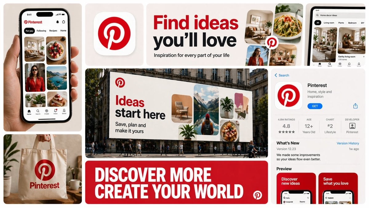
Bento Grid Brand Collage
Am
AmirMušić
@AmirMushich
HomepageView original post
2.7KViewsApr 23, 2026
Model / Categories / LicenseGPT ImageProduct & BrandCC BY 4.0

Brand Ad AI Image Prompt

Prompt

Create a 16:9 horizontal bento-grid brand collage in a polished contemporary campaign style. Use a fixed 3-row, 4-column bento structure with rounded tiles, equal gaps, clean alignment, and a light neutral background. The composition features 11 visible content zones: 1. Top-left (1x2): Tall vertical hero device or primary brand surface, representing the brand's main touchpoint (e.g., app UI on phone, dashboard on laptop, product packaging). 2. Top-middle-left (1x1): Compact square brand asset tile, a distilled identity marker (e.g., app icon, logo mark, product badge, 3D emblem). 3. Top-middle-right (2x1): Wide headline/message tile with large, bold, high-contrast typography, featuring a short strategic campaign message fitting the brand's category and tone (e.g., discovery, creativity, connection, productivity). 4. Center (2x2): Dominant campaign hero scene, the most expressive tile, set in a real-world or branded environment (e.g., outdoor billboard, retail installation, product-in-use lifestyle shot). 5. Top-right (1x1): Secondary device, product surface, or branded object, complementing the main touchpoint (e.g., another device view, product detail, interface zoom-in, social post mockup). 6. Bottom-left (1x1): Category-appropriate branded artifact, a believable unit of value (e.g., payment card, creator card, workspace card, packaging, booking card, album card, prompt card). 7. Bottom-center (2x1): Large bold typography tile with one strong oversized statement in uppercase or bold display typography, a broader campaign line or category promise matching the brand's behavior. 8. Bottom-right (1x2): Tall informational product, interface, or feature tile, a structured branded information surface (e.g., app store page, product page, onboarding screen, feature overview, dashboard overview, discovery feed). All tiles must share the same corner radius, spacing system, and visual polish. Dominant focal points: center hero, top headline, bottom typography. Infer the brand's business model (e.g., social platform, SaaS, retailer, AI product) and adapt content inside each tile to its real business model, product ecosystem, and brand language. Every tile must contain a plausible branded asset based on that business type. Prioritize realistic app UIs, dashboards, product interfaces, or operating surfaces. Only include branded physical objects (packaging, merch, signage) when they make sense. If digital, prioritize screens, interface fragments, campaign graphics. If platform, use realistic platform surfaces. If physical product, use realistic product shots. If service, use realistic booking/marketplace interfaces. Invent only what is necessary, making it feel like the official visual system of the brand, using its real or highly plausible brand identity: logo, color palette, typography, icon language, image treatment, interface style, and tone of voice. Do not force a product category or invent impossible hardware/features. Prefer believable brand adaptation over visual symmetry. The final image must feel like one campaign system with consistent art direction quality, brand palette, typography logic, mockup realism, lighting, and polish. Avoid random collage chaos, tiny unreadable text, and generic placeholder UI. The layout is fixed, but the objects are not fixed; select tile content based on what the brand realistically sells, ships, publishes, displays, or lets users interact with. Never insert category-inappropriate objects just to fill the grid.

Use this Prompt