ColabaseAI logoColabaseAI logoColabaseAI
  • Inspiration
  • History
  • Assets
  • Favorites
  • Generate
  • All Prompts
  • World Cup
  • Product & Brand
  • Poster Design
  • Photography
  • Illustration & 3D
  • Food & Drink
  • UI & Graphic
Terms of Service·Privacy Policy
Prompt

90s Zine Style Brand Cover

Generated Image Preview
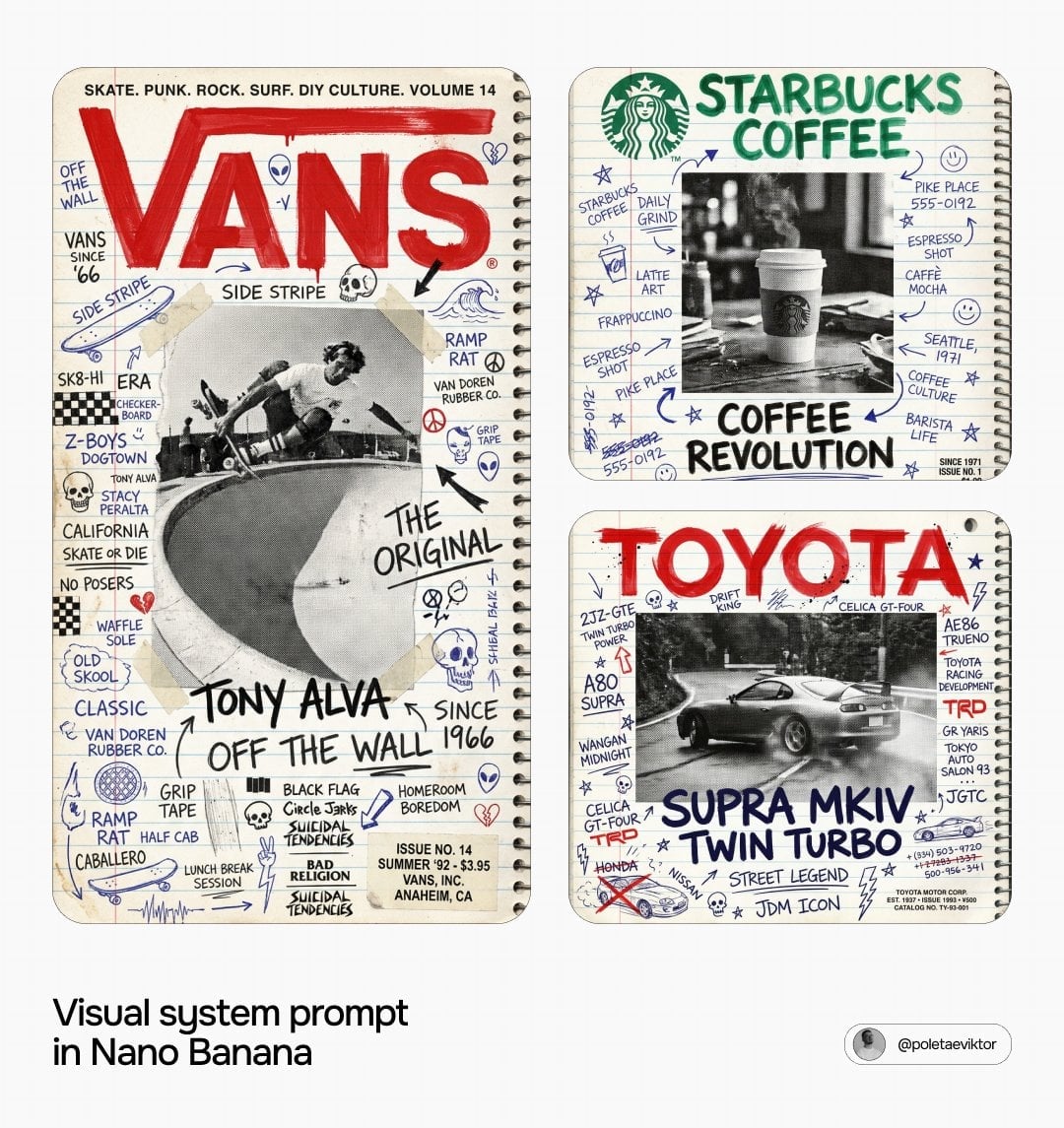
90s Zine Style Brand Cover
VP
Viktor Poletaev
@poletaeviktor
HomepageView original post
5KViewsJun 11, 2026
Model / Categories / LicenseGPT ImageProduct & BrandWorld CupCC BY 4.0

Brand Ad AI Image Prompt

Prompt

A 1990s street culture magazine cover aesthetic, presented on a school notebook page. The background features college-ruled lined paper with horizontal blue lines (8-9mm apart) and a red vertical margin line (30-35mm from the left). The paper is warm white to very slightly cream (#F8F6F0 to #F5F2EA) with subtle texture and real grain. A metal coil spiral binding with punched holes is visible along the right edge, casting a subtle shadow. The entire notebook page is completely covered in handwritten text, doodles, and marks, mimicking a teenager's decorated notebook. Multiple writing styles are present, using blue ballpoint, black ballpoint/felt tip, red pen/marker, and pencil, exhibiting authentic pen-on-paper quality with natural pressure variation and ink bleed. Content includes brand-related language, product names, slogans, dates, numbers, cultural references, stars, arrows, symbols, phone numbers, crossed words, underlines, and circles, filling all available space. A large black and white halftone photograph, with a coarse visible dot screen and high contrast, is centrally placed (60% height, 70% width) on top of the doodle layer. This photograph depicts the brand's iconic hero subject in a dynamic moment, consistent with 1990s magazine printing on newsprint. Some handwritten text continues over the photograph's edges, and it has no border. The brand's canonical, trademark-accurate logo, rendered with exact official letterform geometry, is painted in the upper zone (85-90% width). It features a hand-painted thick marker or wide brush treatment over its correct geometry, showing brush strokes, slight edge roughness, and ink spread, in the brand's most iconic primary color. This logo is the uppermost layer. Below the photograph, a large subject identifier is written in thick dark navy or black marker lettering. Two to three additional larger hand-lettered phrases, authentic to the brand's world, are in the middle zones. In the lower right corner, a small printed text block displays issue information (founding year, date, price, event). A single line of small printed text, with names, references, or cultural touchpoints separated by dots or bullets, runs across the top above the logo. The composition is 3:4 portrait. The overall image has a slight scan grain, like a physically scanned analog artifact from 1992, with a color palette of notebook paper white, blue ruled lines, red margin line, the brand's primary color for the logo, and dark navy/black for handwriting.

Use this Prompt